From Derek
Hey Gary,
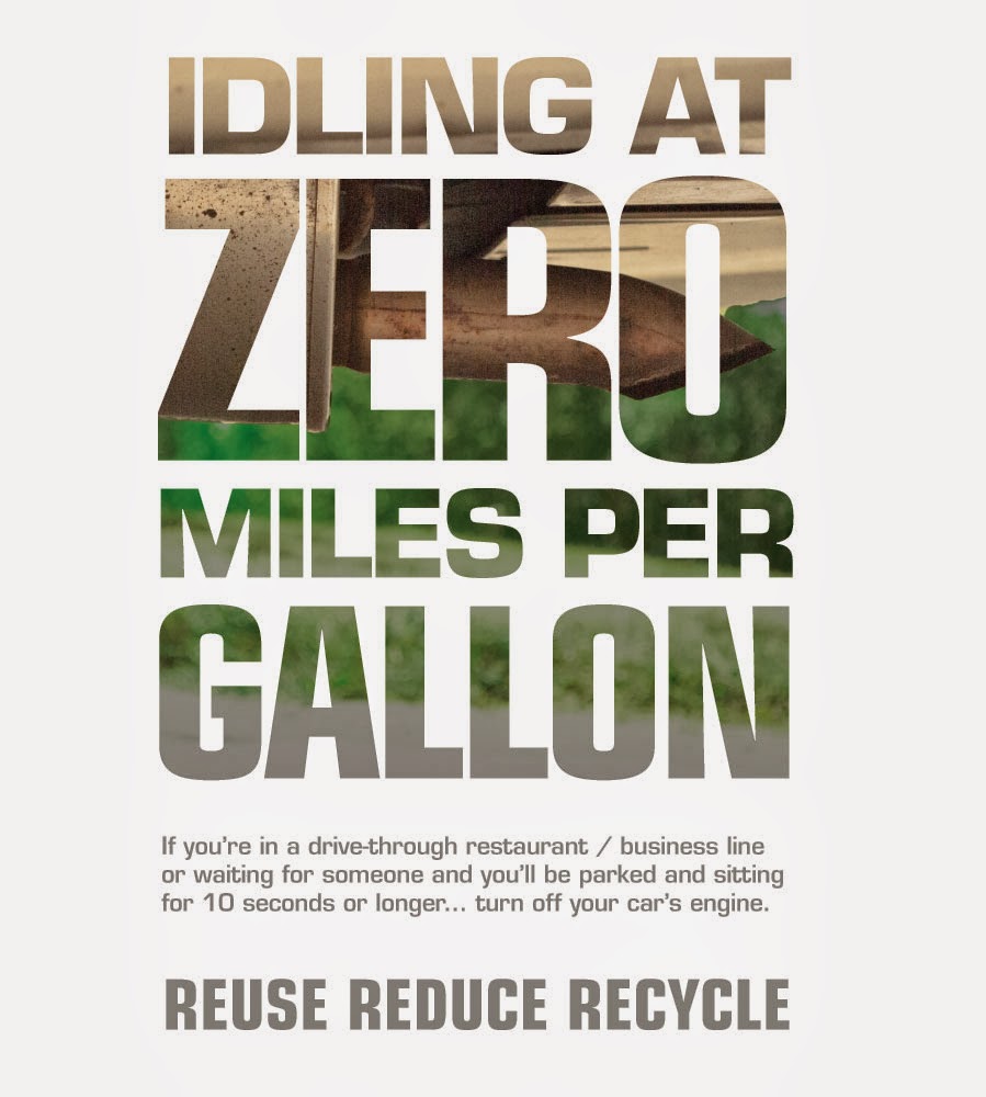
I am quite enjoying the poster that you have designed so far. I enjoy the type faces that you have chosen and think they're working well with the image. I do feel the big yellow type feels a little bit cramped. It also might be nice to try a color that feels a little bit more pollution-y than yellow? just a thought. Also, I'm not entirely sure "idling at zero miles per gallon" makes sense? It sounds like really bad gas mileage. I think something more along the lines of "idling at zero gallons per second" might get the point across better.
My response
I am glad that you enjoy it. I am still working to warm up to it. I do agree that the text needs some work but as for being cramped, I like that you get that reaction because I think that this is a message that needs to not be comfortable. I went with yellow because you can see it and it is a common color associated with driving and roads. Also, I felt that there is enough pollution in the image.
The zero miles per gallon comes from the fact that in American we measure our cars fuel economy by X miles per gallon. When you are idling, that number is zero. I think that the point stays with convention.


